-
Creating Map Report:In this Map report we can set the percentage pallets according to the revenues of the different countries .suppose you have a lot of countries in your data and you want to categorize the revenue of these countries according to the required percentage and set their colors as an identity.Steps:1) Open a report studio.2) Drag the map report in to the work area from tool box.3) Select the world Map.4) Select ‘countries + territories’ from Region layer.5) Select’ None’ from pointer layer.6) Select ‘Oceans’ from display layer.
7) Drag Countries into the Location Drop Zone.8) Drag Measure [Revenue] into the Default Drop Zone.OR9) Drag Measure [Revenue] into the color Drop Zone. [According to our requirement].10) Click on region Layer and select the property pallet from the Properties panel.11) Select the pallet type like:a. Discrete Colors.b. Continuous Colors.12) Categories the measure [Revenue] according to your required percentage that can be shown into different colors that you set with the percentage.
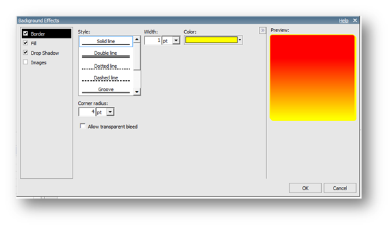
13) Click on Map report Select the Title property [show] from the properties pane.14) Click on Map report and select the background effect property from the properties pane and do the required changes.15) Run the report.· White color on the map shows those countries having revenue less than 10%.· Green color on the map shows those countries having revenue greater than 40%.· Yellow color on the map shows those countries having revenue greater than 10% and less than 40%.
For Further visit: http://www.segmentbi.com/
Friday, 17 January 2014
Map Report With Percentage(%) Pallets In IBM Cognos 10 Report Studio
Subscribe to:
Post Comments (Atom)


No comments:
Post a Comment